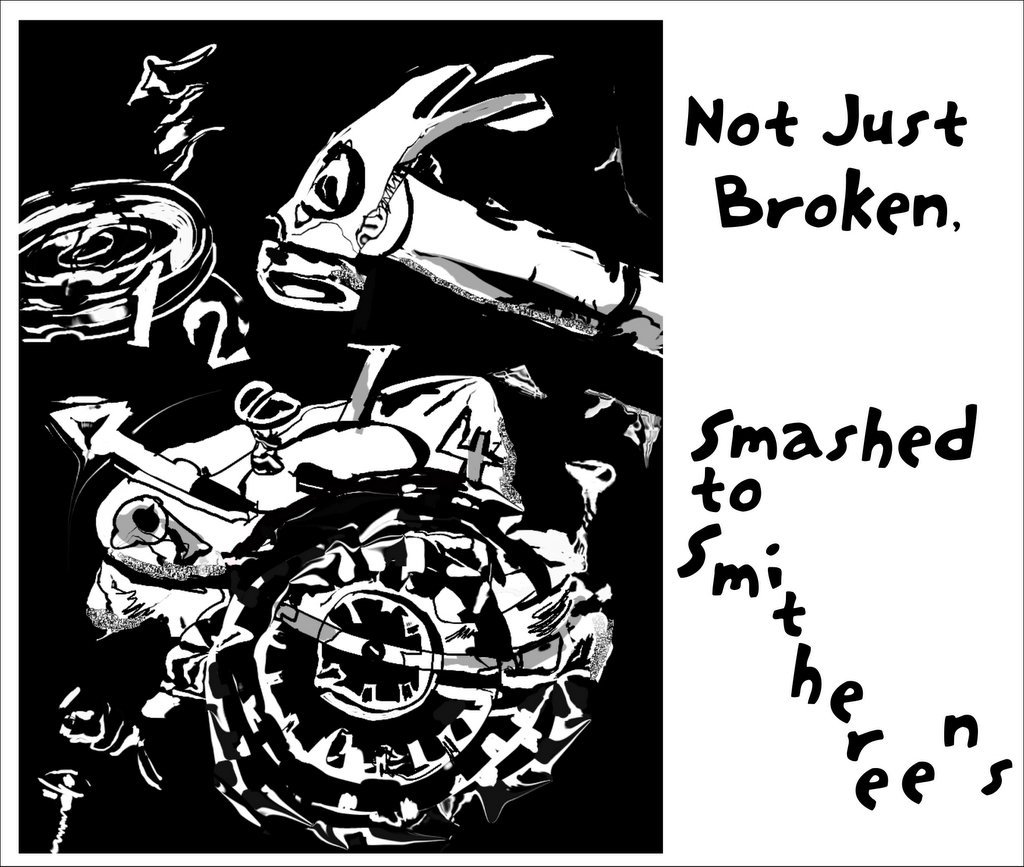
I think I might have done that to an alarm clock while in University. Those 7:45 am art history classes were awful. I love the contrast of this piece. It represents the theme very well. Cheers!
You're going for the gusto! I really like this balck and white work...your colors are always so gorgeous, but this is a really striking departure. It works well with the subject matter.
I know using a limited colour pallet is a challenge for you and you have done an excellent job for the appropriate theme! Well done - great!! Time gets faster with every year ....
The fact that you have fun with your subjects always comes through in your work. Love your bold approach and sentiment - say what you really mean, would ya? Love your stuff!
We're currently experiencing sleep deprivation brought on by daylight savings, so I can relate - sort of "shooting the messenger" though :).
This is a vibrant b&w piece with loads of attitude. It has a frenzied feel which is brought out by the contrasted textures - the details of the main clock parts in black and white, against the more solid whites of the top of the clock and the hammer (squint and this is clearer).
The hammer appears to be enjoying itself, which is a worry!


21 Comments:
I think I might have done that to an alarm clock while in University. Those 7:45 am art history classes were awful.
I love the contrast of this piece. It represents the theme very well. Cheers!
You're going for the gusto! I really like this balck and white work...your colors are always so gorgeous, but this is a really striking departure. It works well with the subject matter.
Sheesh this looks like it hurt! Gotta go and grab a ....somethin....
Very deep and dark and COOL!
Great illustration! I love it! Although I never do that to clocks. I live the life of Riley.
love
Has the clock stopped? Time seems wrong :) Cool illo !
I know using a limited colour pallet is a challenge for you and you have done an excellent job for the appropriate theme! Well done - great!! Time gets faster with every year ....
Very Nice job. Great contrast & balance.
Just what is a "smithereen" anyway?! Love this illo!
Just what is a "smithereen" anyway?! Love this illo!
I also like the black and white in this illustration.
Love the contrast and angles here.
This one is very nice, and thanks for your visit on my blog!
wow, when daylight savings time ends, I usually just set my clock back one hour.
but great illustration. nice solid lines. vivid contrast...
How often I've had that urge with one of my PCs. Great illo. I love the starkness of the black and white.
This comment has been removed by a blog administrator.
LOL
you don't do things half, do you... :)
well, this is probably my favorite illo you've done so far. i think the illo by itself would make a great print!
p.s. - your nephew's origami swan is really cool-looking!
love the style!! Cool illo
The fact that you have fun with your subjects always comes through in your work. Love your bold approach and sentiment - say what you really mean, would ya? Love your stuff!
The simple black, grey and white colors make the illustration so forceful. Good work.
We're currently experiencing sleep deprivation brought on by daylight savings, so I can relate - sort of "shooting the messenger" though :).
This is a vibrant b&w piece with loads of attitude. It has a frenzied feel which is brought out by the contrasted textures - the details of the main clock parts in black and white, against the more solid whites of the top of the clock and the hammer (squint and this is clearer).
The hammer appears to be enjoying itself, which is a worry!
Hahah. Reminiscent of Dali. Well done. I like this one.
Post a Comment
<< Home